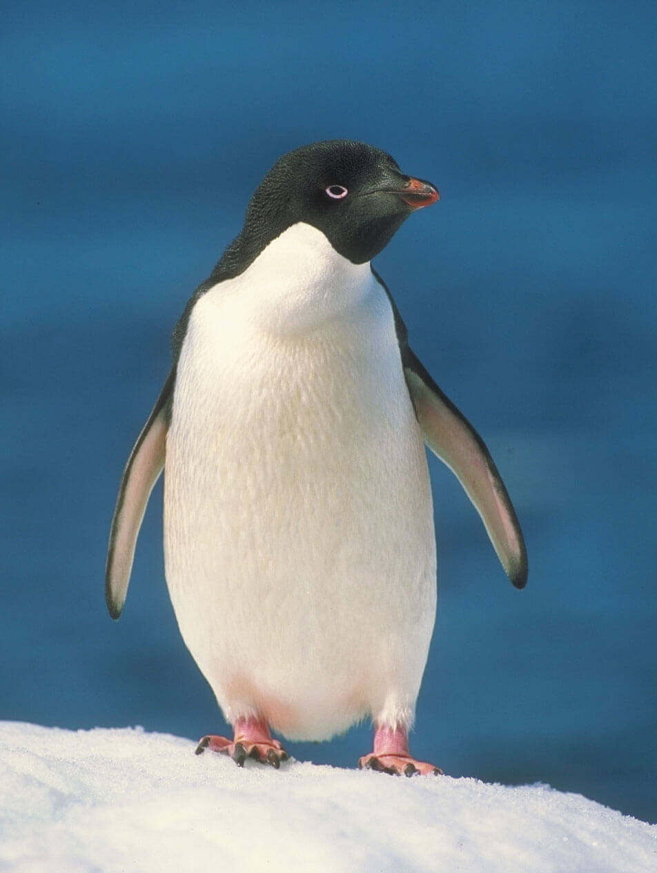
Everyone loves penguins
Penguins are amazing birds! They are not quite like any bird you have seen before in your backyard or at the park. They have adapted to their cold environment in a way that makes them pretty special.
Penguins are flightless birds. While other birds have wings for flying, penguins have adapted flippers to help them swim in the water. Most penguins live in the Southern Hemisphere.
The Galapagos Penguin is the only penguin species that ventures north of the equator in the wild. Large penguin populations can be found in countries such as New Zealand, Australia, Chile, Argentina and South Africa. No penguins live at the North Pole. Penguins eat a range of fish and other sealife that they catch underwater. Penguins can drink sea water.
Penguins spend around half their time in water and the other half on land. The Emperor Penguin is the tallest of all penguin species, reaching as tall as 120 cm (47 in) in height.
King Penguins are the second largest penguin species. They have four layers of feathers to help keep them warm on the cold subantarctic islands where they breed. Chinstrap Penguins get their name from the thin black band under their head. At times it looks like they’re wearing a black helmet, which might be useful as they’re considered the most aggressive type of penguin.
 Back
Back
